- Explanation of the approach to historic emissions and division of the carbon budget
- The global carbon budget
- The country carbon budget chart
- The individual elements of the carbon budget chart
a) budget boxes; global totals & country shares
b) per capita country emissions over time
c) gross country emissions over time
d) share calculation methodology
e) easy visualization of CREDIT:DEBIT
The global carbon budget chart
PAST & FUTURE with Paris Agreement temperature targets (& carbon budgets from IPCC AR5)
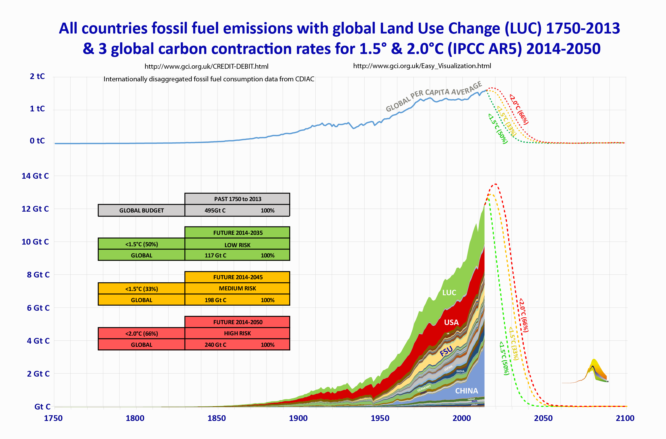
The chart below shows cumulative historic emissions of carbon dioxide; together with demarcation of the total areas representing the remainder of Budgets 1-3 (GREEN, AMBER, RED) as of 2013. The X-axis shows years (from 1750); the Y-axis, the mass of carbon emitted in that year (expressed as Gigatonnes, or billions of tonnes of carbon). The different coloured layers, stacked on top of each other, represent the historic emissions of the different country Parties. Additionally the chart includes a global estimate for emissions resulting from ‘land use change’ (‘LUC’).The three dotted lines (GREEN, AMBER and RED) are also projected from the global per capita average, assuming 2014 as a population base-year at 7 billion. Gross and per capita together demarcate the remaining carbon that may be emitted consistent with the remainder of Budgets 1-3. The scale of the transformation required to buck the trend of emissions rising in line with real population and economic growth, to a near immediate decarbonisation, should be readily apparent.
The GREEN dotted line, shows the LOW RISK OF NON-COMPLIANCE pathway. This is the cumulative mass of carbon (117 Gt C) that may still be emitted into the atmosphere consistent, as from 2014, with a 50% chance of keeping warming to <1.5° C. It can be seen that following a sharp decline, the line reaches zero by around 2035 ie within 20 years.
The AMBER dotted line, shows the MEDIUM RISK OF NON-COMPLIANCE pathway. This is the cumulative mass of carbon (198 Gt C) that may still be emitted into the atmosphere, as from 2014, consistent with a 33% chance of keeping warming to <1.5° C. This shows a sharp decline with net neutrality by around 2045.
The RED dotted line, shows the HIGH RISK OF NON-COMPLIANCE pathway. This is the cumulative mass of carbon (240 Gt C) that may still be emitted into the atmosphere, as from 2014, consistent with a 66% 10 chance of keeping warming to <2.0° C. This shows a sharp decline with net neutrality by 2050. This is the path beyond which climate catastrophe is more likely than not.
It is the integrals under the lines that are determind by 'climate science' before the pathways are drawn. Nonetheless these paths are accurate. However, if paths were to decline immediately, the rate of subsequent decline could be somewhat slower, providing for slightly later dates for net neutrality to be attained.
NB It is recognized that for many the impacts of climate change are already devastating. Reference to levels of risk is not intended to imply the existence of a ‘safe’ level of climate change; but simply to reflect the likelihood (on the basis of IPCC projections) of limiting warming to the temperature limits agreed in Paris. If these limits were to be exceeded, there is an increased likelihood that the climate rate-change dynamics will slip beyond our ability control.